Designer Watch Trends 2026: What Feels Current
A watch is no longer expected to disappear beneath a cuff. The strongest designer watch trends 2026 put the wrist back in focus, using form, color, and proportion to make an everyday object feel deliberate. This is less about chasing a single status symbol and more about choosing a piece with a point of view.
For urban creatives, that shift is welcome. A well-chosen watch can sharpen a plain white tee, add intention to a work uniform, or bring one considered detail to a weekend fit. The best designs still tell the time well. They simply understand that function and personality belong in the same case.
Designer Watch Trends 2026: A More Personal Wrist
The direction for 2026 is not maximalism for its own sake. It is a move toward watches with clearer identities. Think shaped cases instead of generic circles, dials that reward a second look, and references that feel rooted in design history without becoming costume.
There is also a practical reason for this change. Phones handle timekeeping with zero effort, so a wristwatch has to earn its place differently. It can be a mechanical object, a styling signature, a conversation starter, or a small daily ritual. The watches attracting attention are designed for that emotional job as much as the technical one.
Sculptural cases take center stage
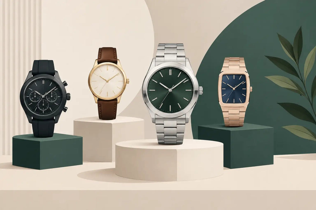
Round cases remain essential, but 2026 has room for stronger silhouettes. Cushioned squares, barrel shapes, softened rectangles, and asymmetric profiles give a watch immediate presence without requiring a loud logo. A shaped case can make even a restrained dial feel distinctive.
This is where Italian-minded designs continue to resonate. Brands such as Gagà Milano show how oversized numerals and expressive case architecture can turn a watch into an outfit anchor. The trade-off is straightforward: a highly recognizable form is less universal than a minimal round watch. That is exactly why it works for someone who wants a piece that feels chosen rather than merely acquired.
For first-time buyers, proportion matters more than trend language. A case with visual weight may wear larger than its millimeter measurement suggests, especially with a wide bezel or integrated bracelet. Try to imagine the watch in the context of your usual sleeves, rings, and bag hardware, not only under product photography.
Smaller sizes, better balance
The return to compact proportions is one of the most wearable designer watch trends of 2026. Cases in the mid-30mm to high-30mm range are gaining ground across styles and genders, while traditionally dressy dimensions are being worn more casually. The appeal is easy to understand: smaller watches sit comfortably, work with layered sleeves, and let details speak without overwhelming the wrist.
This does not mean large watches are over. A bold 42mm piece can still look right when its dial is clean and its lugs are controlled. The real shift is toward balance. Buyers are looking past the old assumption that bigger automatically means more impressive.
A smaller watch also makes a strong case for everyday ownership. It moves easily from laptop desk to dinner reservation, from a canvas tote to a tailored jacket. If you are buying one watch to wear often, a proportionate case will usually outlast a dramatic size choice.
Texture replaces unnecessary complication
In 2026, visual depth often comes from the surface rather than an overloaded dial. Brushed metallic finishes, grainy matte textures, subtle gradients, embossed patterns, and layered chapter rings bring character without asking the wearer to decode too much information.
This is a particularly good development for design-led watches. Texture changes with the light, making a simple three-hand watch feel alive throughout the day. A charcoal dial can look nearly black in a meeting and reveal a warm graphite sheen outside. A pale blue can read crisp and architectural rather than sporty, depending on the finish.
Complications still have their place, especially when they serve a real habit. A date window is useful. A chronograph can be satisfying and visually balanced. But decorative subdials and crowded scales are losing their hold when they make a watch harder to read. The new luxury is clarity with detail underneath it.
Color becomes more edited
Color is present, but it is more considered than novelty-driven. Deep wine red, forest green, ink blue, tobacco brown, smoky gray, cream, and muted salmon offer personality while remaining easy to wear. These tones feel especially relevant beside neutral clothing and the material palette of modern everyday carry: black nylon, silver hardware, stonewashed denim, and warm leather.
Bright yellow, vivid orange, and electric blue still belong in the conversation, particularly for summer or collector-minded purchases. They work best when the rest of the watch is disciplined. A colorful dial paired with a familiar case and clean markers feels intentional. Add too many competing elements and the result can date quickly.
For gift buyers, a textured neutral or rich dark color is usually the safer route. It carries more individuality than black while fitting more wardrobes than a high-saturation statement shade.
Vintage Cues, Used With Restraint
The most successful retro references in 2026 avoid pretending to be museum pieces. They borrow what was good about earlier eras: domed crystals, warm-toned lume, compact cases, rail-style minute tracks, and leather straps with a little texture. Then they pair those details with dependable modern construction and a cleaner overall profile.
A vintage-inspired watch works when it feels like a contemporary interpretation, not a replica with artificial aging. For many wearers, that means choosing one or two heritage cues rather than every possible one. A warm cream dial and a tapered strap can be enough.
This is also why watches with a story continue to appeal. Made in Japan references, aviation details, motorsport color blocking, and classic field-watch proportions offer a clear design language. The strongest versions are specific without becoming overly literal.
Customization moves from novelty to signature
Personalization is becoming more refined. Rather than adding every available option, buyers are selecting a dial color, engraving, strap, or configuration that makes a watch feel tied to their own routine. UNDONE has helped shape this conversation by treating customization as part of the design process, not an afterthought.
The best custom choice is often the quietest one. A caseback engraving, a contrast seconds hand, or a second strap can give a watch private meaning while keeping its public appearance clean. It also makes a watch a more thoughtful gift, especially for milestones that deserve something more lasting than a generic accessory.
Be selective, though. Customization can improve emotional value, but it may limit versatility or future resale appeal. If you want a single watch for frequent wear, start with a flexible base design and make the personal detail secondary.
Straps carry more of the style work
The strap is no longer a fixed finishing touch. It is one of the easiest ways to shift a watch between settings. Smooth black leather feels direct and polished. Suede softens a formal case. Rubber brings a cleaner sport note than many people expect. A steel bracelet adds structure, while woven fabric can make a heritage-inspired watch feel relaxed.
In 2026, quick-change systems are especially useful because they turn one good watch into several looks. That practical flexibility fits the wider move away from disposable accessories. Instead of buying multiple near-identical watches, choose one with a strong case and rotate the strap with the season, outfit, or occasion.
Match metals thoughtfully, but do not over-police them. A steel watch can sit well beside mixed-metal jewelry if the overall look has intention. The more useful rule is to keep the visual temperature coherent: cool steel and black leather feel crisp; gold-tone details and warm brown leather feel richer.
What to Look for Beyond the Trend Cycle
The right watch should still make sense after the mood board changes. Start with how you actually dress and move through the week. A polished rectangular watch may be perfect for office-heavy routines and evening plans. A durable diver-inspired model may better suit travel, active weekends, and casual layers. Neither is objectively more current if it does not fit your life.
Then consider quality signals that affect ownership, not just appearance: a clear warranty, authorized sourcing, movement information, water resistance suited to your habits, and materials that will age well. A curated retailer such as Bang On is valuable here because the edit reduces the noise without reducing the design range.
Finally, allow room for instinct. The watch you keep reaching for in a crowded lineup is usually telling you something. In a year defined by personal style, the most relevant choice is not the one everyone recognizes. It is the one that makes your everyday uniform feel more like your own.