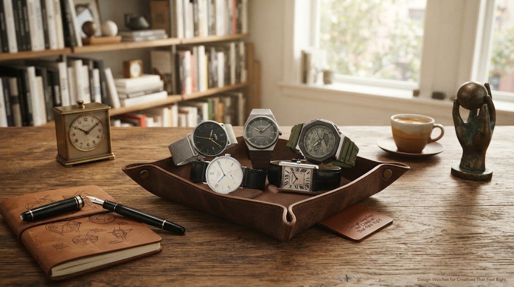
Design Watches for Creatives That Feel Right
A watch says a lot before you say anything. In creative circles, that matters. The best design watches for creatives do more than tell time - they sharpen a look, reflect a point of view, and fit naturally into the rhythm of daily work, whether that means client meetings, studio hours, commutes, or late-night editing sessions.
A watch says a lot before you say anything. In creative circles, that matters. The best design watches for creatives that feel right do more than tell time - they sharpen a look, reflect a point of view, and fit naturally into the rhythm of daily work, whether that means client meetings, studio hours, commutes, or late-night editing sessions. For design-savvy creatives and urban professionals who want a watch that feels authentic rather than trend-led, the right choice usually comes down to deliberate design details: a balanced dial, a case shape with character, and a strap that delivers both comfort and functional style.
That is why the right watch rarely comes down to trend alone. Creatives tend to notice proportion, texture, typography, finishing, and the quiet decisions most people miss. A dial that feels balanced. A case shape with character. A strap that softens a formal silhouette or gives a clean design more edge. Good design is rarely loud for no reason. It is deliberate.
This guide looks at what separates a design watch from a fashion watch, how form and function work together through comfort and movement, how to choose a piece that fits your creative identity, when statement designs make sense, what different price points really offer, and why authenticity and sourcing matter if you want a watch that works across an urban creative lifestyle.
What makes watch design for creatives different
A creative buyer usually wants more than status signaling. The appeal is often in the design language itself. Some watches lean architectural, with restrained dials, crisp markers, and thoughtful use of negative space, reflecting the broader discipline of watch design behind those visual choices. Others are more expressive, using unusual numerals, asymmetry, or color blocking to create personality without becoming gimmicky.
The difference is subtle but important. A fashion watch may chase a seasonal look. A well-chosen design-led watch tends to hold up longer because it has a stronger concept behind it and a clearer visual and practical sense. You can feel the intent in the proportions, the material choices, and the way it sits on the wrist. That kind of unique design is usually what separates a lasting piece from a trend-driven one.
There is also the matter of versatility. Most creatives are not building outfits around one occasion. They want pieces that move between work and weekends, between clean tailoring and casual layers. A strong watch should look considered in both settings. That usually means avoiding anything too overloaded or too generic.
Form matters, but function and automatic movement still decide the keeper
A beautiful watch that is annoying to wear will end up in a drawer. For creatives, practicality is part of the appeal. If you are wearing a watch every day, comfort, legibility, and durability matter just as much as visual impact. Lightweight materials like titanium can also make a watch more comfortable for all-day wear. Often, functional details are what turn a beautiful piece into one you actually keep wearing.
Case diameter is a good place to start. Oversized watches can look dramatic in photos, but they do not always wear well in real life, especially if you spend long hours typing, sketching, shooting, or moving through the city. A more balanced case often feels more modern because it wears with ease. Design confidence does not need bulk. A slim case around 8mm to 11mm thick is often easiest for daily wear. It is also worth checking water resistance if you want something practical for everyday wear, and at least 50m is a sensible baseline for everyday durability.
Legibility matters too. Minimal dials can be striking, but there is a line between clean and inconvenient. If the hands disappear into the dial or the markers are too abstract, the watch becomes more object than tool. The hour hand should still be easy to distinguish against the dial at a glance. A sapphire crystal is also worth checking because it offers strong scratch resistance for daily wear. Breathable straps made from silicone or fabric are often the most comfortable choice for long days. That may work for some collectors, but for everyday wear, clarity usually wins.
Then there is movement. A mechanical watch offers one kind of appeal, while Quartz watches are often underrated in design conversations. They are accurate, low-maintenance, and ideal for people who want reliable performance without extra ritual. Mechanical pieces feel more tactile, more traditional, and often more emotionally engaging. Neither is automatically better. It depends on whether you value convenience, craft, or a mix of both. In the watch world, the Omega Aqua Terra >15,000 Gauss, introduced in 2013, remains a strong example of progress against magnetic fields. A stronger power reserve may matter more if you rotate between several watches.
How to choose a watch that fits your creative identity
The easiest mistake is buying the watch that looks good in isolation but not on you. A better approach is to think about your own visual language, often inspired by what you already wear and naturally respond to. Many creatives develop that taste through art school, a design course, or other structured visual training, which shapes what feels right on the wrist.
If your style leans minimal, a watch with a clean dial, refined case, and restrained palette will feel natural. Black, silver, navy, off-white, and muted earth tones tend to integrate easily with a modern wardrobe. If your look is more expressive, you may want stronger numerals, a distinctive case shape, or a more playful use of color. The key is coherence. A watch should extend your aesthetic, not interrupt it.
This is where curation matters, because strong designers and watch designers make selection easier by giving buyers clearer creative directions. Strong design collaborations can also make a watch easier to connect with because the storytelling is clearer. A selective assortment is often more useful than a giant catalog because it narrows the field to watches with a clearer design point of view. Bang On has built its appeal on exactly that kind of edit - pieces that feel distinct, authenticated, and worth choosing over louder but less thoughtful alternatives.
Another useful filter is how you want the watch to read in conversation. A good choice can express the core idea behind your aesthetic without saying too much. Some pieces communicate understatement. Others signal taste through recognizable design codes, whether those cues come from brands, artists, or shared cultural references across the wider world. Some are more collectible and character-driven. None of those directions are wrong, but each creates a different impression.
The design details and modern aesthetics worth paying attention to
Creatives tend to respond to details, and watches reward close looking. Start with the dial design, since that is where most of the visual identity lives. Consider the balance between markers, logo placement, hands, subdials, open space, and the overall display of time. The Omega Speedmaster Moonwatch is a useful benchmark here, especially in how its subdial size and text placement create such balanced proportions. A crowded layout can feel busy fast. A sparse layout can feel elegant, and a minimalist dial is a strong option when the proportions are right. Concentric circles can add order and visual rhythm when used carefully on the dial.
Typography is another giveaway. Great watches often get the type exactly right - not just readable, but tonally aligned with the rest of the design. A playful case with severe typography can feel conflicted. A classic dial with overly novelty-driven numerals can age badly. Not every cue has to follow generally accepted watch norms if the whole composition still feels resolved. When the type, shape, and finish all speak the same language, the watch feels resolved.
Materials affect both mood and wearability. Stainless steel is versatile and sharp, especially for everyday use. A leather strap adds warmth and can make a watch feel more personal, though it needs more care and may not suit humid climates or active routines. Nylon and rubber can introduce a more casual or sport-driven tone. The right strap can completely change how a watch behaves with the rest of your wardrobe.
Finishing matters as well. Matte surfaces often appeal to buyers drawn to modern aesthetics because they feel more contemporary and understated. Polished cases catch light beautifully but can read dressier. Brushed metal tends to be forgiving and practical, especially for daily wear. The Royal Oak, designed in 1970 by Gerald Genta and inspired by a diver's helmet, shows how strong geometry can come from industrial or nautical references. Hublot's Big Bang pushes a similar object-based idea with porthole-like design language. Bell & Ross draws on aircraft cockpit dials, while Breitling's Navitimer pairs a chronograph with a rotating bezel for pilots. Even Rolex is often treated as a benchmark for clear hierarchy and proportion. Again, it depends on your habits as much as your taste. The Jaeger-LeCoultre Reverso protects its face during polo games, while the MB&F HM7 Aquapod takes its form from jellyfish, showing how function and storytelling can shape a watch just as much as finish.
Design watches for creatives at different price points, from affordable to luxury watches
A good design watch does not need to be extreme in price to feel special, whether you are looking at accessible models or luxury watches. What matters more is whether the watch delivers a clear point of view and solid build quality for the money.
At accessible price points, quartz models often offer the strongest mix of style and usability. This is where many design-focused brands do their best work, creating watches that feel thoughtful and distinctive without turning the purchase into a high-stakes decision. For younger buyers, gift shoppers, or anyone building a rotation, this is often the smartest place to start.
In the mid-range, you tend to see stronger finishing, more nuanced case construction, better straps, and sometimes automatic movements. This tier often appeals to buyers who care about design first but also want the watch to feel more substantial in hand.
At the higher end, the conversation shifts slightly, as some buyers are also paying for more technically impressive engineering. You may be paying for movement complexity, smaller production runs, or a more established brand story. Perpetual calendars are one example of the kind of complexity that can justify the jump. White gold is another choice that can change both the cost and the visual tone. That can be worth it, but only if those things matter to you. A more expensive watch is not automatically a more creative choice. Sometimes the sharper edit is choosing the watch with the clearest design integrity, not the biggest price tag. The best examples at any budget are the ones where that integrity survives the price conversation.
When statement design works, and when it does not
There is a place for bold watches. The right one can become a signature. Some of the most memorable statement pieces come from artist-led projects and a first watch experiment that introduced a new visual language. For creatives who dress simply, a more expressive timepiece can carry the whole look. It can also become a personal marker - the thing people remember.
But statement design needs discipline. If a watch relies on novelty alone, it can lose energy quickly. Most creative ideas are at least partly second-hand, but strong design transforms influences rather than copying them. The best expressive watches still have internal logic, and a great example of statement design still directs focus instead of scattering it. Their eccentricity feels intentional, not random. They stand out because the concept is strong, not because every detail is competing for attention. In other examples, bold design stays disciplined through proportion, spacing, or restraint.
If you already wear bold eyewear, graphic prints, or heavily branded pieces, a quieter watch may actually create a more balanced result. On the other hand, if your wardrobe is mostly monochrome and clean, a watch with shape, color, unusual dial treatment, or even cues borrowed from art, especially when those references are edited with discipline, can add exactly the right amount of tension.
Why authenticity and sourcing matter
For design-minded shoppers, trust is part of the product. A watch can look great online and still become a bad buy if the sourcing is questionable. Official warranty coverage, direct brand relationships, and clear retail provenance matter because they protect the long-term value of the purchase.
That is especially true if you are buying from recognized international brands or choosing a gift. The design may catch your eye first, but confidence in authenticity is what makes the purchase feel complete. A good retailer does not just sell product. It reduces uncertainty.
The best watch is the one you keep reaching for
Creative life rarely stays in one mode. Some days call for restraint, others for character. There are many examples of watches that balance both, but the right one is the one that fits your life. It works with your wardrobe, your schedule, and your eye for detail without asking for too much in return.
Choose the piece that feels considered on your wrist, not just impressive on a product page, and take a closer look at proportion and daily comfort rather than surface impression alone. Explore different styles until one makes immediate visual sense. If it carries good design, honest function, and a point of view that still feels like you six months from now, that is usually the right call.
Share
Perfect polish is out. The images, objects, and accessories getting real attention right now feel softer, grainier, smaller, and a little unpredictable. That is exactly why Low-fi / Lo-fi aesthetic...